Design
Two primary considerations guided my design approach for the Care App: wayfinding and alignment with the clinical mental models of providers.
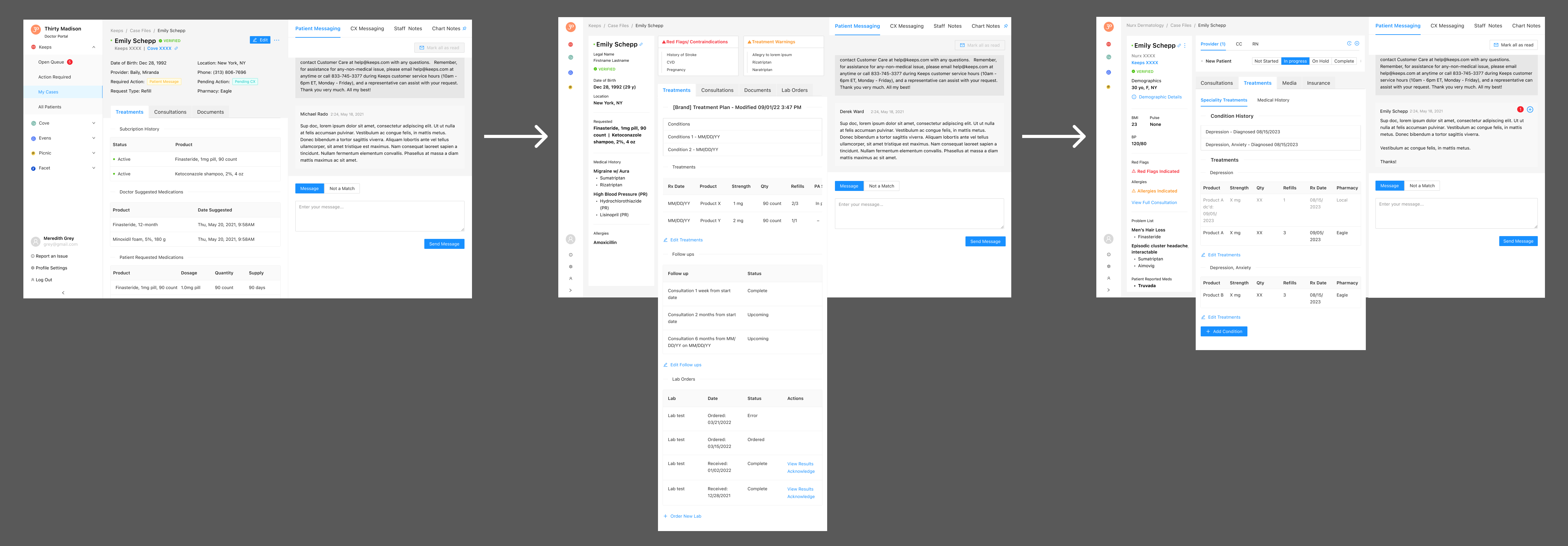
To kick off the design process, I developed low-fidelity designs, informed by design stories created in collaboration with the product management team.

Throughout the review of these low-fidelity wireframes, I sought input from engineering to ensure feasibility and consulted clinical leads about initial high-level functionality.
Subsequently, I transitioned to crafting final designs. For this project, I chose to begin by designing an ideal state encompassing identified improvements and informing north-star objectives. This approach allowed for collaboration with the product management and engineering teams to break the project into manageable segments while delivering an MVP version of the ideal state.
Two major design updates emerged:
Global Sidebar
I introduced a dedicated area within the patient case file, serving as a "snapshot" of critical information accessible to providers at any point during a patient encounter, regardless of the tab or position on the page. The sidebar was organized to align with the order of information sought by providers during encounters:
- Demographic information
- Request information
- Consultation information
- Background medical information
Prescribing Experience
Understanding that providers follow a specific process when treating patients, I revamped the prescribing experience to match the mental models of providers handling multiple high-acuity conditions. The new design allowed providers to formulate and adapt treatment plans efficiently, recording changes for future encounters.
The north-star designs underwent multiple iterations throughout the process, incorporating feedback from clinical stakeholders.


